UNIHACK Website

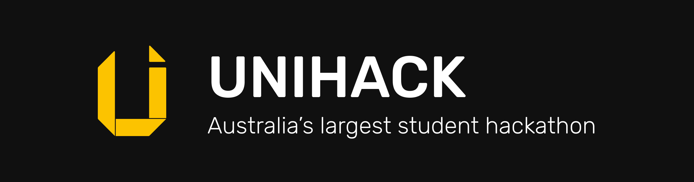
The front door to Australia's largest student hackathon.
Once it was confirmed that UNIHACK 2019 would be going ahead in March that year, it was decided that the website would need to be updated. This could have just been a simple content update, after all we did have a perfectly working website. The existing site was great way to find out about our past events, but as UNIHACK had grown into the largest student hackathon in Australia we knew we could do more in this space. Coupled with major changes to our tech team, the time had come to evolve our site.
The UNIHACK website has two goals: first, to provide information about our events to students and potential sponsors, and secondly, to give a face to UNIHACK Incorporated, the organisation that grew out of its university club roots. This is the story of how unihack.net was reborn.
Experience
The number one priority for us in this space was ensuring that the site provided a great experience. If you’ve ever spoken to me about experience you’d know I look at life as a collection of continuously interlaced experiences. But what exactly makes a “great” experience? In my view, a great experience is memorable, fun, and inspiring. But we’re talking about a website here, not a day at Disneyland. Firstly, the site should provide all the information that visitors would expect from it. Simple enough. And it should do so in a way that is easy to consume and understand.
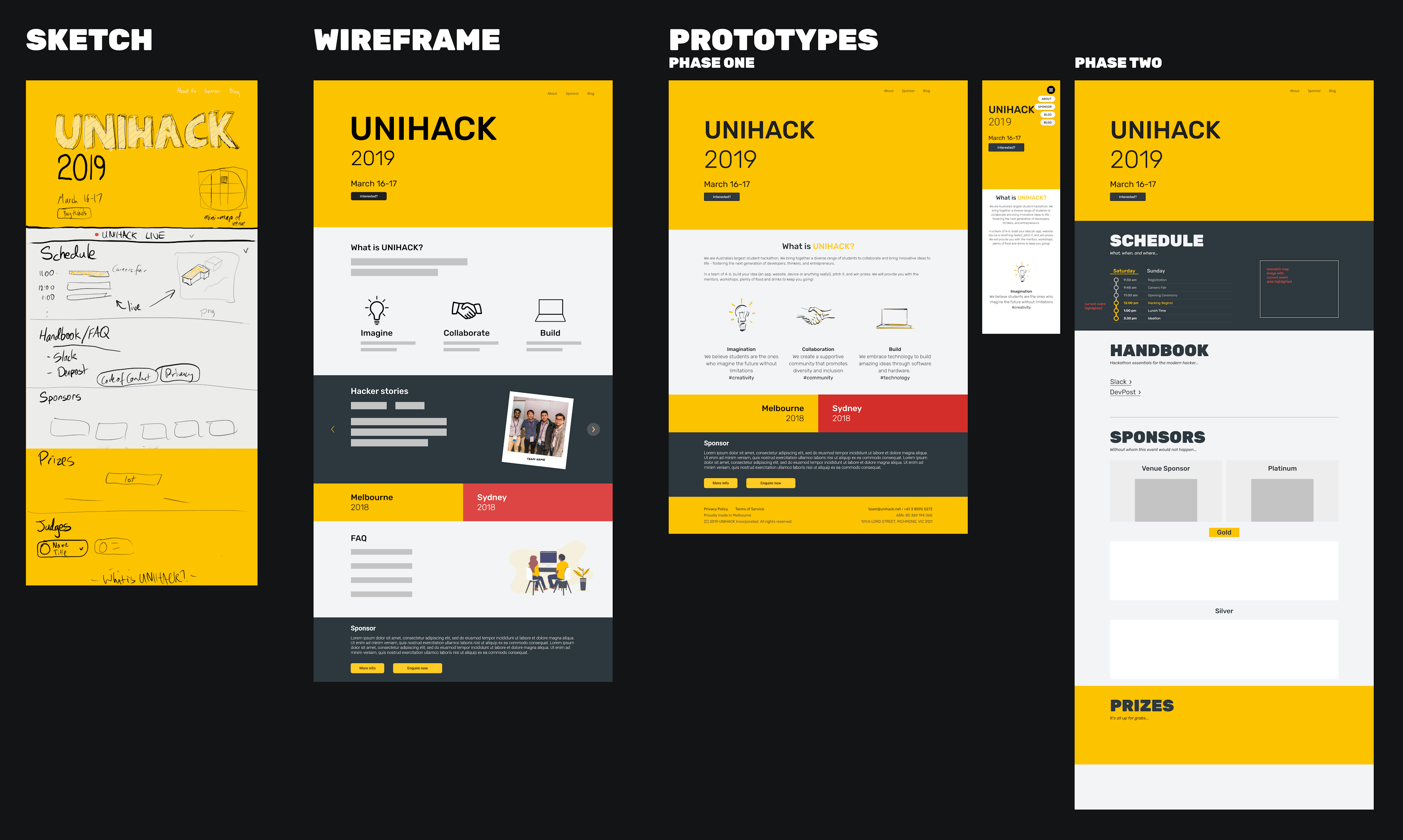
In December 2018, we worked through exactly what the site’s purpose would be as a team from three different perspectives: Design, Marketing, and Engineering. We spent hours on it, noting down exactly what information to include, researching other hackathon sites and observing the layout, colours, and information hierarchy, and sketching out what we felt was a good direction to head in. Some of those sites directly inspired our design while others gave reassurance that we were making the right decisions. The output of those hours: alignment across the three teams, and a sketch of how we wanted to present UNIHACK to the world.

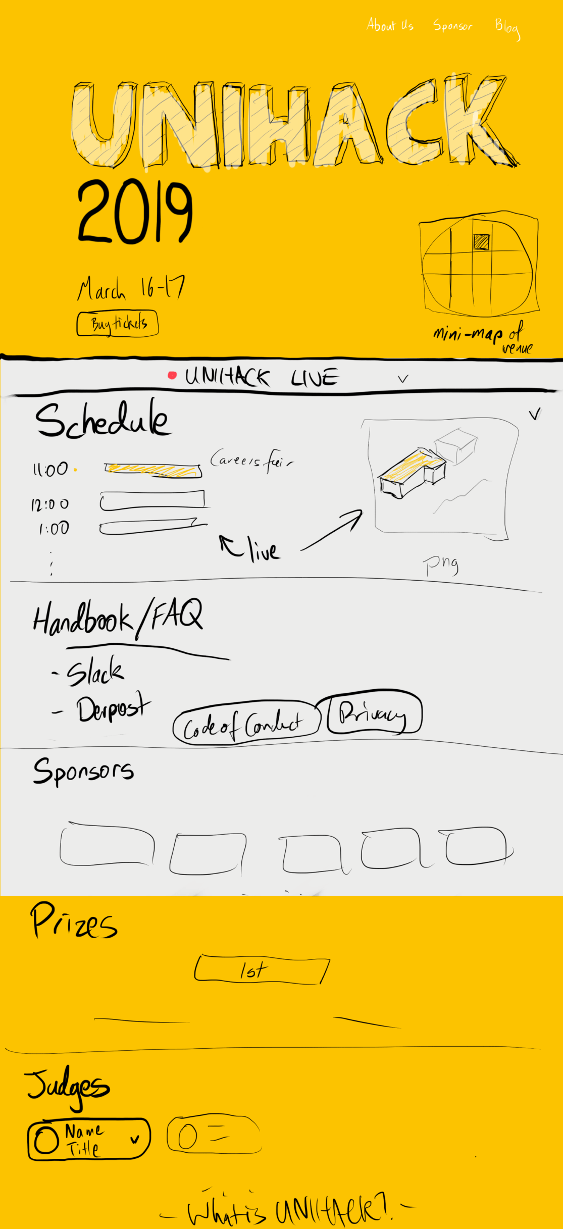
It would be big and bold. For the event we would have a schedule, updating live throughout the day. Quick links to essential services would help our participants find what they needed during the event, and of course we’d showcase our generous sponsors. What’s a hackathon without prizes? We’d need to detail those too, and the esteemed judges who would be awarding them. When we’re not hosting an event, we would hide all of that and show just the information relevant — what is UNIHACK, links to past events, and why you should consider sponsoring. What we wanted to build was an entirely contextual website.
So, as UNIHACK’s new designer and Engineering Lead, I had my work cut out for me. Oh, and did I mention I was building this from scratch - no code, no project, no builds. Which meant setting up all of that — a framework, a style guide, an easy way to deploy, the list goes on…all in addition to the main content. I better get cracking then.
Design
First thing’s first. What exactly would this site look like? I had used Figma in 2018 to design our sponsorship mini-site and my own personal site, but never for something with an actual deadline. Why Figma? I wanted our team to be able to actually see the designs, navigate around at their own pace, suggest changes and give feedback, and in some cases even work on them. With everything seamlessly saved in the cloud and supported across macOS and Windows, Figma couldn’t have made realising that goal any easier.
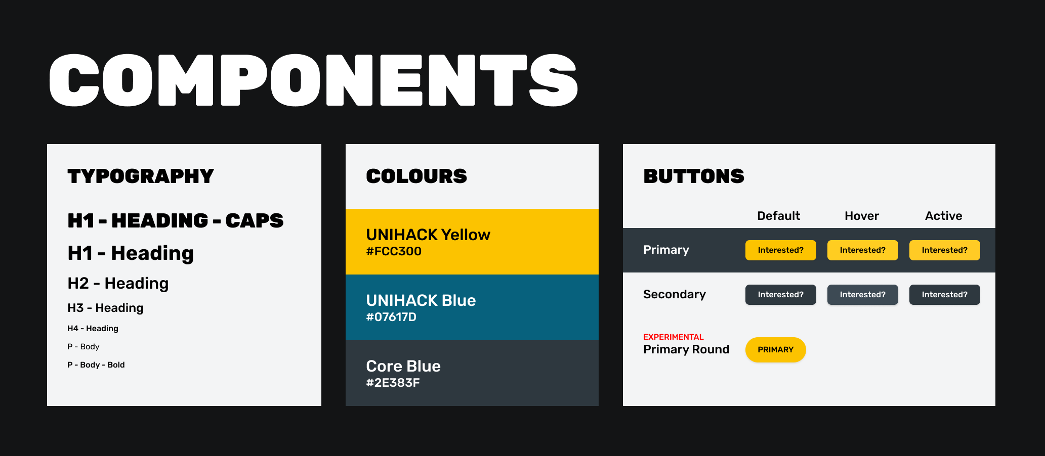
With that decided it was time to actually start designing. First, a wireframe. I wanted to get the layout sorted so everything else could fall into place. I know it’s unconventional but I added a splash of colour at this stage to keep me aligned to the original idea. With a basic wireframe done I could start to see how the site would come together. I quickly began to realise I would need to start thinking about typography, link and button styles, and of course our colour scheme. Coming from a programming background I knew that making components reusable early on would greatly reduce the time and effort required later on, and so I started assembling our style guide. I say started because this is very much an iterative process that is still ongoing, even as I write this more than four months later. The typography was updated as late as the week leading up to the hackathon with the introduction of the full caps heading, an almost brutalist style that would separate sections of the site.

With the wireframe done it was time to gather some feedback from the rest of the team. I made sure everyone had view-access to the Figma files, making it easier for them to follow along, at least for those who had accepted the email invitation *cough*. A couple of minor changes later and I was ready to begin work on the high fidelity (hi-fi) prototype.
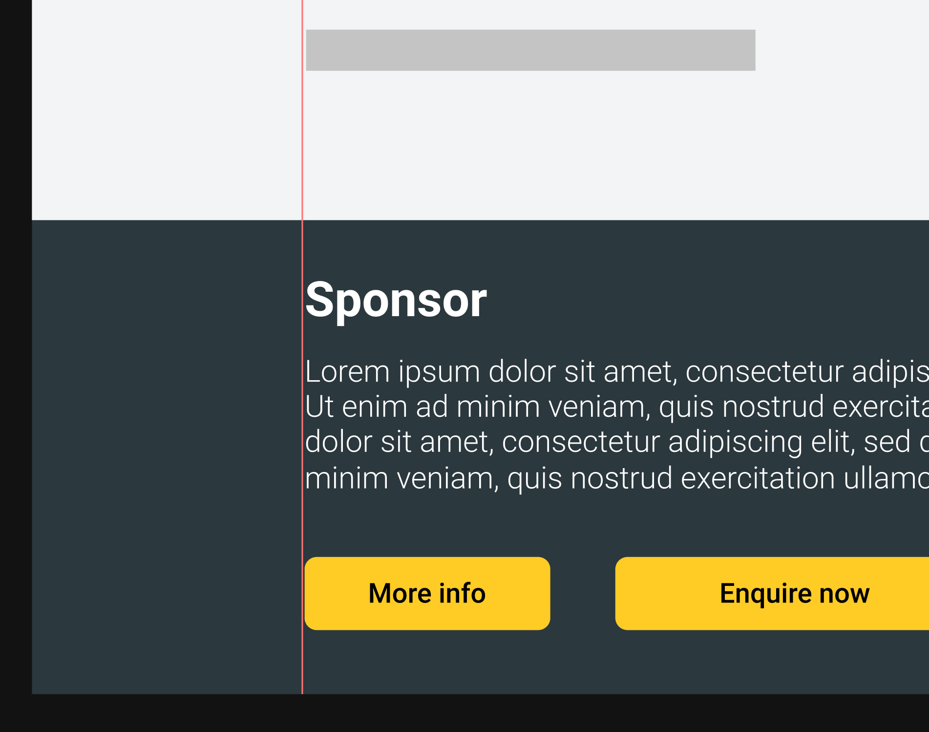
This is where the style guide came in handy, or at least the parts of it I had built out. It was important at this stage to consider how I would be implementing the designs — you can design anything you want but if you can’t implement it then what’s the point? An example of where this thought process comes in handy is with breakpoints. Not just mobile/desktop but with the general layout of elements on the page. Would everything be aligned to the same left and right margins? In this case, no. While all the text on the page was aligned to the margins, the sections containing the text often featured bold background colours that spanned the full width of the page. From a design perspective this certainly looks nice and from a code standpoint it’s certainly not difficult to implement, but it would influence how the component and the main page layout itself would be built.

Fast forward a couple of weeks and the hi-fi prototype for the homepage was done. You’ll notice a few differences from the wireframe, one of which is the removal of the ‘Hacker Stories’ section— we decided not to go ahead with including it in the initial release and hence the design was never finalised. After another round of feedback and a few more minor changes, it was finally time to get coding. Or so I thought.

Development
This was a brand new project, meaning there were many decisions to be made. Out of the box CMS or built from scratch? Static or dynamic site? React/Angular/Vanilla? GitHub Pages or something else? Well, let’s start to answer some of those.
The site would be built from scratch. Why? We didn’t want to be restricted in any way. Building from scratch would ultimately give us control over the entire process, including design, development, and deployment. Whilst the simplicity of a static site is certainly appreciated, with the vision of a platform in mind I made the decision to go dynamic. Again for flexibility and to make sure we weren’t unnecessarily limiting ourselves early on.
As for using a framework/library over, well, nothing, the decision was a fairly straightforward one. Aside from the benefits of having some of the fundamentals provided (such as page routing), it was important that the site be easy to update in the future with a big emphasis on reusability. In my experience, this is far easier achieved with the help of a framework or library.
And now for the absolute question in web development. A question that haunts each and every developer, relentlessly keeping us up at night. The answer to which is sought after almost as much as the answer to the ultimate question itself. A question that for some will never be answered, and to others was answered long ago. This was it. I wondered whether I would even be able to answer it myself. Doubt had taken over at this point, the Anthony that once was, now just a shadow of something greater. But I knew there was no turning back. I had to push forward. I had to answer the question:
Angular or React? Or Vue? Or something else entirely?
A wrong choice could set us back years, if not decades. They’d write stories about us long into the future, of how this decision led to the destruction of humankind as we knew it.
Back in the real world it was a fairly simple choice.
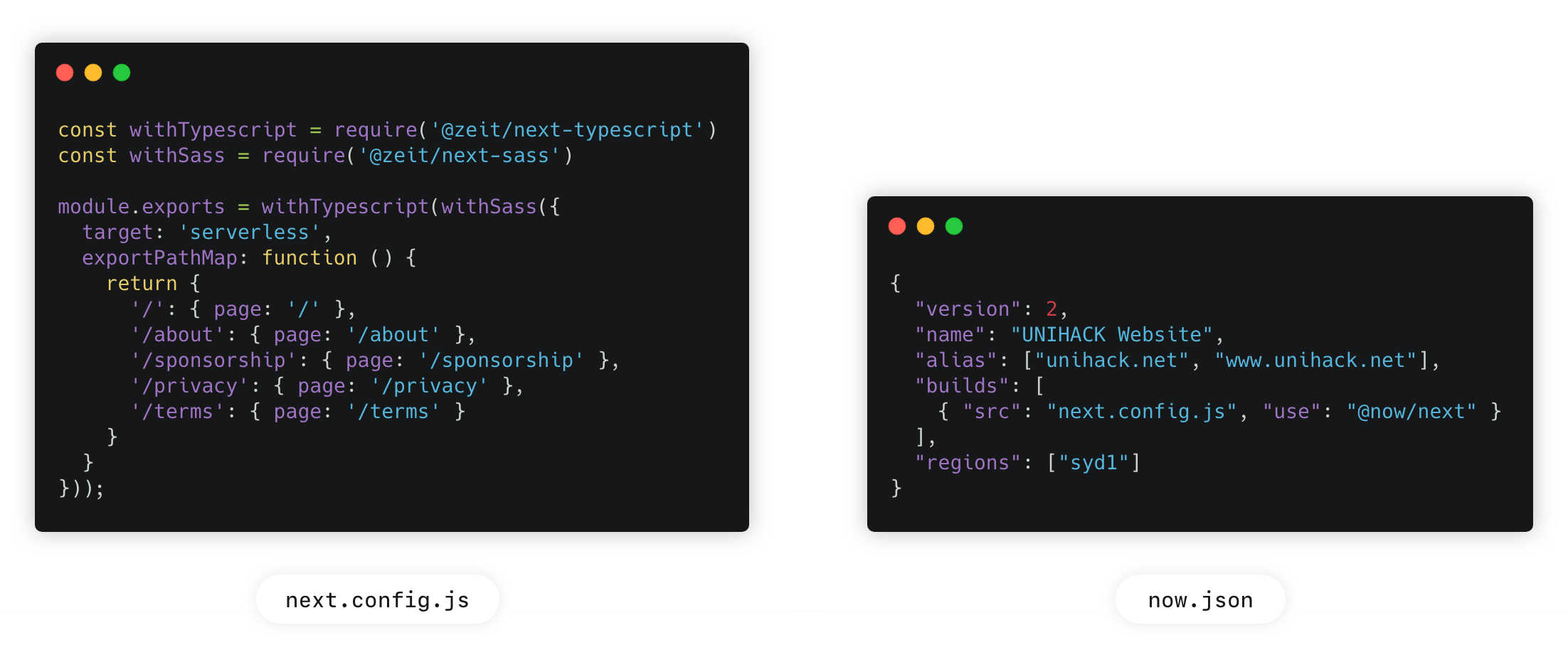
I’d previously worked with both Angular and React, and having worked with Angular full-time for nearly 18 months, I could’ve saved a bit of time and built the site quite comfortably. However, one of the greatest perks of being on the UNIHACK team is the opportunity to learn something different without fear. Angular was too familiar. Additionally, as we would soon be recruiting for the tech team I had to make sure that we would be able to find people willing to work on the site. React was the clear choice. But even React on its own wasn’t enough, and I was feeling adventurous. I wanted to try a bunch of new technologies and really learn as much as I could during this time. Let’s try server-side rendering. Let’s have an easy-to-use test environment. Now if you’ve ever looked into server-side rendering with React you’d know it’s not exactly trivial without some kind of framework.
Enter Next.js, a React framework that makes server-side rendering easy and even has a built-in router. With support for TypeScript and Sass too, all that was needed was a simple config file and away we went. Oh and you declare your site’s routes in the same config file as your plugins — weird flex, but ok. After sorting that out, a new question arose — how would we host the site? Well, with Next comes Now, and if that sentence makes no sense whatsoever then welcome to the world of web development. (Unfortunately for that joke, Now has been renamed Vercel. Fortunately it is much easier to google...now). Vercel (previously Now) gives us serverless deployments that make deploying the fun part rather than the wait-ten-minutes-and-hope-it-worked part. Deployments take seconds, unique URLs generated with each change that live as long as you’d like them to. With Next.js, each page gets its own serverless lambda with benefits ranging from improved SEO to quicker time-to-interaction. Getting it all up and running was as easy as another config file, complicated only by a bug with Next/Vercel (that thankfully had a workaround and was fixed a couple of weeks later), and by my complete lack of understanding of how Cloudflare worked. And yes I may have taken the site offline for a whole hour as I was trying to migrate the domain across and get DNS working correctly. My bad.

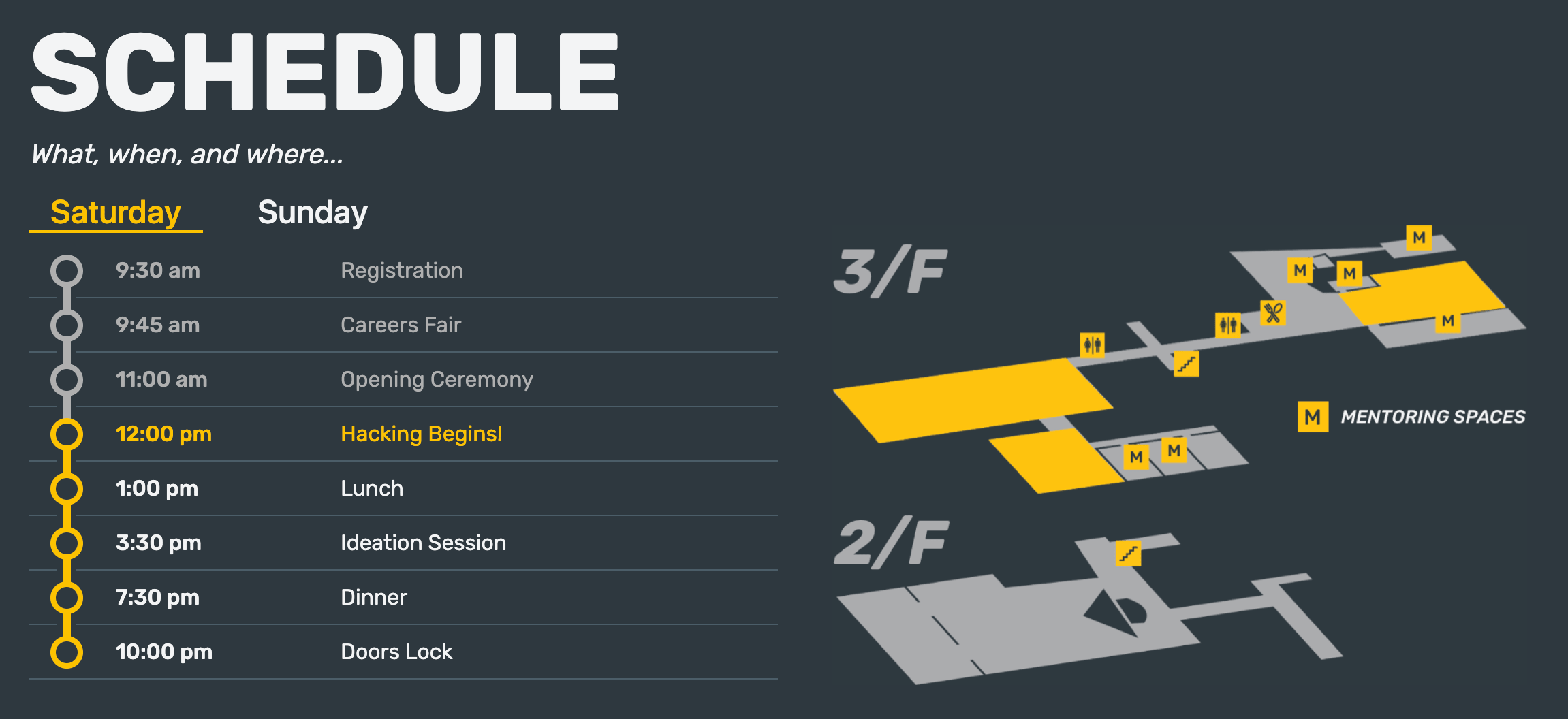
As for building the site, it’s…well pretty similar to any other site I guess. There’s the homepage and a few smaller pages. The sponsorship mini-site that was previously in a separate repository had been React-ified and now lived with the rest of the site. Sponsor data (name, tier, image) is all loaded through a JSON file to reduce coupling and make updating even simpler. Similarly, the dynamic schedule component, built only in the week leading up to the hackathon, receives its data exclusively from a JSON file.
A live, real-time schedule was the first feature on the original sketch and seeing it being used during the hackathon weekend (after a couple of bug fixes) was incredibly rewarding. The bugs that needed fixing were interesting, a direct result of one of the decisions I had made earlier — to go server-rendered. When loading the site, it would check the current time and work out which event to display as ‘active’ on the schedule. As the site was hosted and rendered on a server in San Francisco, the ‘current time’ was not in fact the current time of the user viewing the site, but rather that of the server halfway across the world. So at 9:30 am on Saturday March 16 when the first event in the schedule was supposed to go from the white ‘future’ state to the yellow ‘active’ state and nothing happened, needless to say I was a bit confused.
“But it works on my machine” echoed across the organisers room multiple times that day. Later that night when I realised the issue I couldn’t help but laugh. Good old timezones. After trying many different solutions I realised I was over-complicating it. A simple update to the schedule data to include Melbourne’s timezone and a minor update to the code and everything was working once again, thankfully on machines other than my own. Fun fact: about a month later, a Sydney region was added to Now, allowing the site to be deployed and rendered on a server that wouldn’t have exhibited this issue. But I’m glad for the issue, without it I wouldn’t have learned to think about the possible side-effects of server rendering. And yes the site has since been updated to serve from Sydney.

As I mentioned earlier, reusability was a big consideration when designing and building the site. Everything from buttons to the header to entire page layouts are React components with customisable parameters. It’s easy to go overboard with customisability and future-proofing but when done sensibly it can be invaluable.
Designing and building the new UNIHACK platform was not easy, nor was it quick. In fact it’s not even done yet, with a heap of work still to be done as I write this. It has however, been a remarkable learning experience. My first real attempt at a design process, a deep dive into Next.js and Vercel, and having to support something that has, at times, actual users. This is something I’m very proud to have worked on, and I can’t wait to show you what’s next.
Oh I almost forgot to answer a question: would we be supporting Internet Explorer?
Absolutely not.